import matplotlib
matplotlib.use("Agg")  # non-interactive backend for doc rendering
import numpy as np
import pandas as pd

from spotforecast2.plots.outlier_plots import plot_outlier_flags

idx = pd.date_range("2025-01-01", periods=96, freq="15min", tz="UTC")
rng = np.random.default_rng(7)
original = pd.DataFrame(
    {"Actual Load": 10.0 + rng.normal(0.0, 0.05, 96)}, index=idx
)
flagged = original.copy()
flagged.iloc[[10, 40, 70], 0] = float("nan")

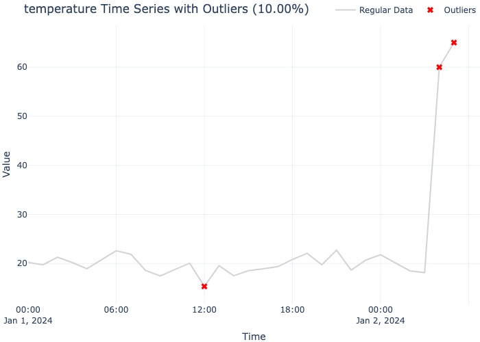
fig = plot_outlier_flags(
    flagged, original, "Actual Load", ylabel="load (scaled units)"
)
assert len(fig.axes[0].lines) == 1
assert fig.axes[0].collections[0].get_offsets().shape[0] == 3
print("plot_outlier_flags: 3 flagged slots marked")
plot_outlier_flags: 3 flagged slots marked