This module provides comprehensive tools for detecting and visualizing outliers in time series data using the Isolation Forest algorithm.
Overview
The outlier detection module includes four main functions:
get_outliers()visualize_outliers_hist()visualize_outliers_plotly_scatter()plot_outlier_flags()
These functions work together to provide a complete workflow for outlier analysis in time series data.
Installation
The outlier visualization functions require matplotlib for histograms and plotly for interactive scatter plots.
Using pip:
pip install matplotlib plotlyUsing uv:
uv pip install matplotlib plotly
Quick Start
Basic Outlier Detection
import pandas as pdimport numpy as npfrom spotforecast2_safe.preprocessing.outlier import get_outliers# Create sample data with outliers 42 )= pd.DataFrame({'temperature' : np.concatenate([20 , 5 , 100 ),50 , 60 , 70 ] # outliers 'humidity' : np.concatenate([60 , 10 , 100 ),95 , 98 , 99 ] # outliers # Detect outliers = get_outliers(data, contamination= 0.03 )for col, outlier_vals in outliers.items():print (f" { col} : { len (outlier_vals)} outliers detected" )
temperature: 4 outliers detected
humidity: 4 outliers detected
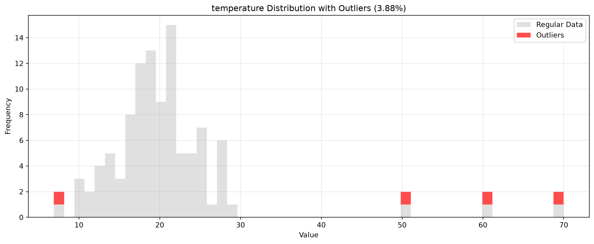
Histogram Visualization
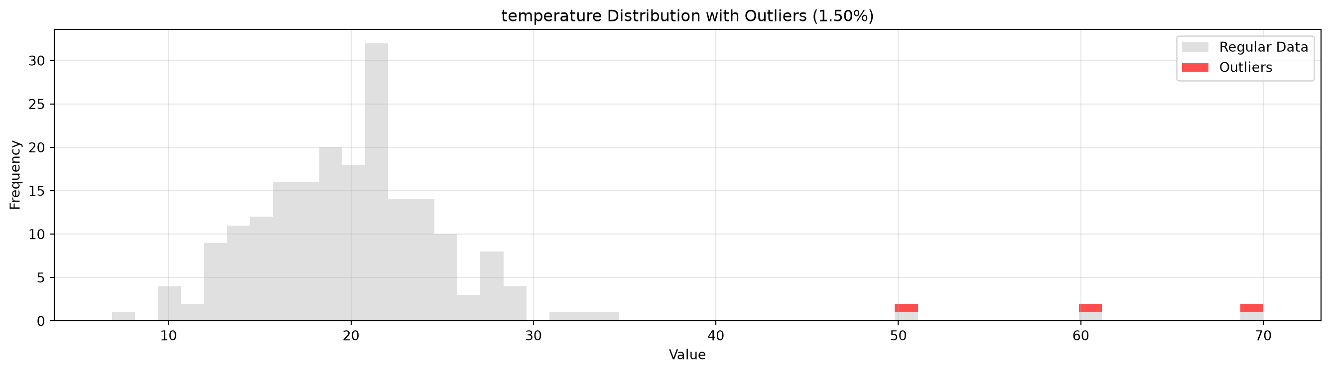
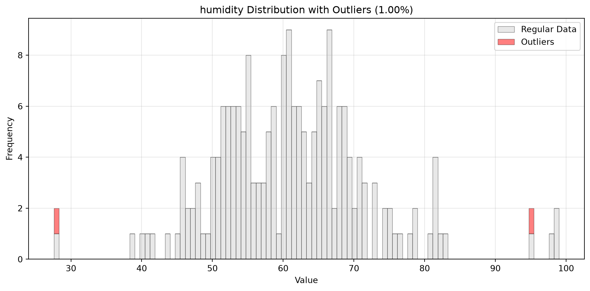
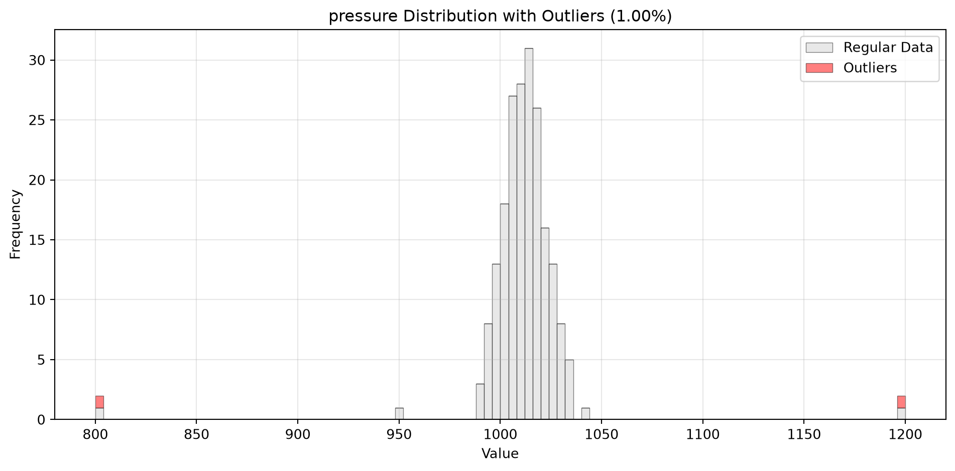
from spotforecast2.plots.outlier_plots import visualize_outliers_hist# Create sample data 42 )= pd.DataFrame({'temperature' : np.concatenate([20 , 5 , 100 ),50 , 60 , 70 ] # outliers = data_original.copy()# Visualize outliers = 0.03 ,= (12 , 5 ),= 0.7
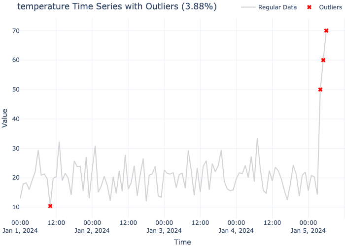
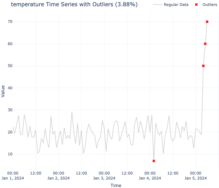
Interactive Plotly Visualization
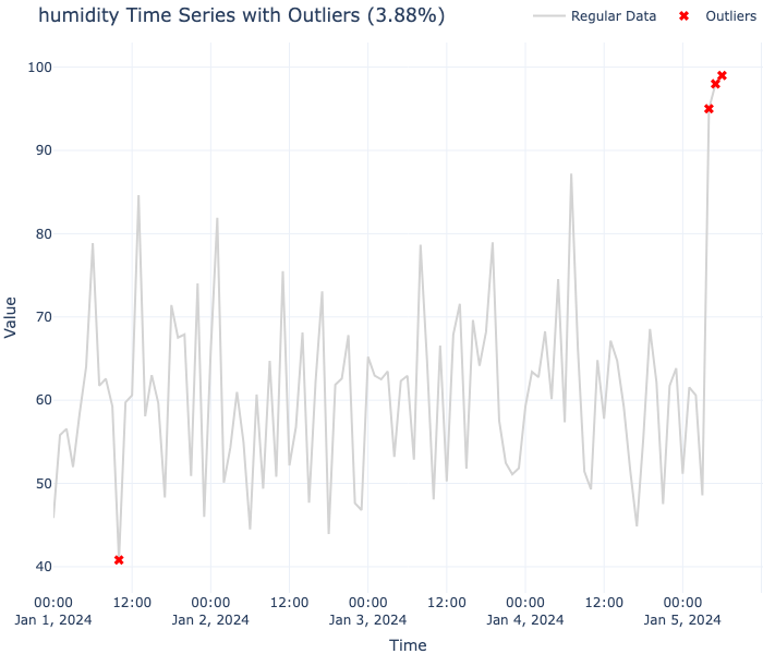
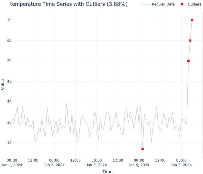
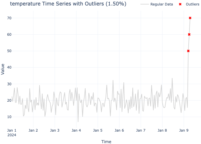
from spotforecast2.plots.outlier_plots import visualize_outliers_plotly_scatter# Create time series data = pd.date_range('2024-01-01' , periods= 103 , freq= 'h' )= pd.DataFrame({'temperature' : np.concatenate([20 , 5 , 100 ),50 , 60 , 70 ] # outliers = dates)= data_original.copy()# Visualize outliers with interactive plot = 0.03 ,= 'plotly_white'
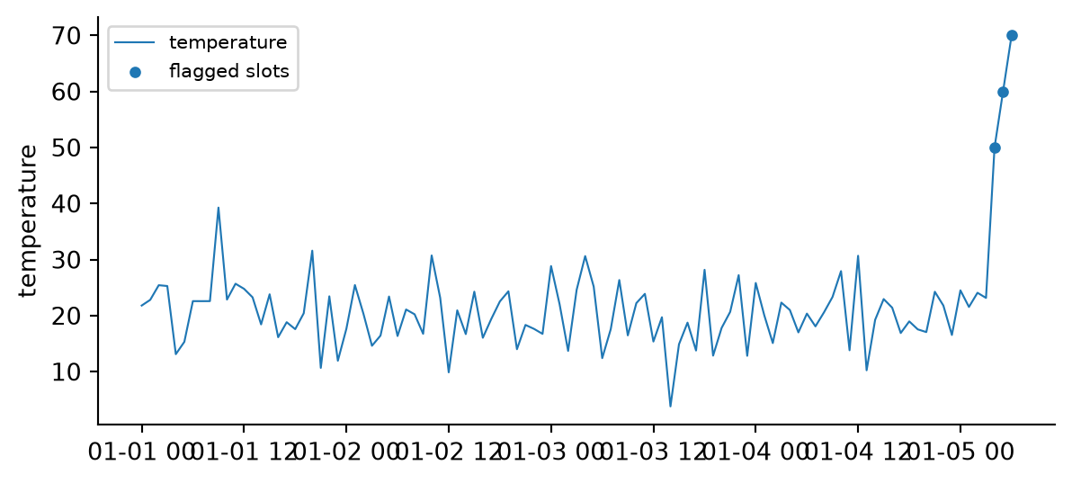
Flagged-Slot Time Series Plot
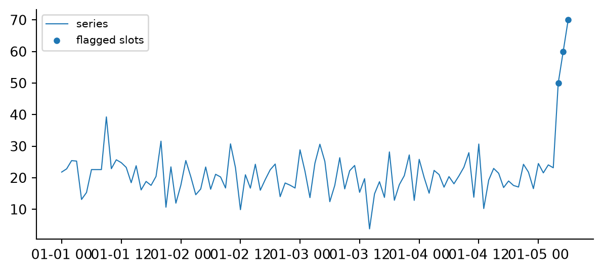
When a frame has already been through spotforecast2_safe.preprocessing.outlier.mark_outliers, the flagged slots hold NaN and no detector needs to run again. plot_outlier_flags() draws the original series as a line and marks exactly those slots:
import matplotlib.pyplot as pltfrom spotforecast2.plots.outlier_plots import plot_outlier_flags# Time series whose outliers were already marked as NaN, # e.g. by spotforecast2_safe.preprocessing.outlier.mark_outliers = pd.date_range('2024-01-01' , periods= 103 , freq= 'h' )= pd.DataFrame({'temperature' : np.concatenate([20 , 5 , 100 ),50 , 60 , 70 ] # outliers = dates)= data_original.copy()100 , 101 , 102 ], 0 ] = np.nan= plot_outlier_flags('temperature' ,= 'temperature' ,= 'flagged slots' ,= 'temperature' ,
API Reference
get_outliers()
Detect outliers in each column using Isolation Forest.
Signature:
def get_outliers(= None ,float = 0.01 ,int = 1234 ,-> Dict[str , pd.Series]Parameters:
dataDataFrame
Required
The input DataFrame to check for outliers
data_originalDataFrame
None
Optional original DataFrame before outlier detection. If provided, helps identify which values became NaN due to outlier detection
contaminationfloat
0.01
The estimated proportion of outliers in the dataset (between 0 and 1)
random_stateint
1234
Random seed for reproducibility
Returns:
A dictionary mapping column names to pandas Series of outlier values.
Raises:
ValueError - If data is empty or contains no columns
Example:
import pandas as pdimport numpy as npfrom spotforecast2_safe.preprocessing.outlier import get_outliers# Create sample data 42 )= pd.DataFrame({'A' : np.concatenate([np.random.normal(0 , 1 , 100 ), [10 , 11 , 12 ]]),'B' : np.concatenate([np.random.normal(5 , 2 , 100 ), [100 , 110 , 120 ]])# Detect outliers = get_outliers(data, contamination= 0.03 )for col, outlier_vals in outliers.items():print (f" { col} : { len (outlier_vals)} outliers detected" )
A: 4 outliers detected
B: 4 outliers detected
visualize_outliers_hist()
Visualize outliers using stacked histograms.
Signature:
def visualize_outliers_hist(list [str ]] = None ,float = 0.01 ,int = 1234 ,tuple [int , int ] = (10 , 5 ),int = 50 ,** kwargs: Any,-> None Parameters:
dataDataFrame
Required
The DataFrame with cleaned data (outliers may be NaN)
data_originalDataFrame
Required
The original DataFrame before outlier detection
columnslist[str]
None
List of column names to visualize. If None, all columns are used
contaminationfloat
0.01
The estimated proportion of outliers in the dataset
random_stateint
1234
Random seed for reproducibility
figsizetuple[int, int]
(10, 5)
Figure size as (width, height)
binsint
50
Number of histogram bins
**kwargsAny
-
Additional keyword arguments passed to plt.hist() (e.g., color, alpha, edgecolor)
Returns:
None. Displays matplotlib figures.
Raises:
ValueError - If data or data_original is empty, or if specified columns don’t exist
Example:
import pandas as pdimport numpy as npfrom spotforecast2.plots.outlier_plots import visualize_outliers_hist# Create sample data 42 )= pd.DataFrame({'temperature' : np.concatenate([20 , 5 , 100 ),50 , 60 , 70 ] # outliers 'humidity' : np.concatenate([60 , 10 , 100 ),95 , 98 , 99 ] # outliers = data_original.copy()# Visualize outliers = 0.03 ,= (12 , 5 ),= 0.7 ,= 'black'
visualize_outliers_plotly_scatter()
Visualize outliers using interactive Plotly scatter plots.
Signature:
def visualize_outliers_plotly_scatter(list [str ]] = None ,float = 0.01 ,int = 1234 ,** kwargs: Any,-> None Parameters:
dataDataFrame
Required
The DataFrame with cleaned data (outliers may be NaN)
data_originalDataFrame
Required
The original DataFrame before outlier detection
columnslist[str]
None
List of column names to visualize. If None, all columns are used
contaminationfloat
0.01
The estimated proportion of outliers in the dataset
random_stateint
1234
Random seed for reproducibility
**kwargsAny
-
Additional keyword arguments passed to go.Figure.update_layout() (e.g., template, height)
Returns:
None. Displays Plotly figures.
Raises:
ValueError - If data or data_original is empty, or if specified columns don’t existImportError - If plotly is not installed
Example:
import pandas as pdimport numpy as npfrom spotforecast2.plots.outlier_plots import visualize_outliers_plotly_scatter# Create time series data 42 )= pd.date_range('2024-01-01' , periods= 103 , freq= 'h' )= pd.DataFrame({'temperature' : np.concatenate([20 , 5 , 100 ),50 , 60 , 70 ] # outliers 'humidity' : np.concatenate([60 , 10 , 100 ),95 , 98 , 99 ] # outliers = dates)= data_original.copy()# Visualize outliers = 0.03 ,= 'plotly_white' ,= 600
plot_outlier_flags()
Line plot of a series with its already-flagged slots marked. Runs no detection of its own: the flagged slots are the positions where data_original holds a value and data holds NaN, which is the contract of spotforecast2_safe.preprocessing.outlier.mark_outliers. Follows the stateless conventions of spotforecast2.plots.evaluation: it returns a matplotlib.figure.Figure, never calls plt.show(), and does not mutate matplotlib.rcParams.
Signature:
def plot_outlier_flags(str ,* ,str | None = None ,str | None = None ,str = "series" ,str = "flagged slots" ,float = 0.8 ,float = 14.0 ,str = "" ,str = "" ,str = "upper left" ,| None = None ,tuple [float , float ] = (6.3 , 2.9 ),-> FigureParameters:
dataDataFrame
Required
Frame after outlier marking; flagged slots hold NaN
data_originalDataFrame
Required
Frame before outlier marking, same index as data
columnstr
Required
Name of the column to plot
line_colorstr
None
Line color; None uses matplotlib’s active color cycle
marker_colorstr
None
Marker color for the flagged slots
line_labelstr
“series”
Legend label for the series line
marker_labelstr
“flagged slots”
Legend label for the markers
linewidthfloat
0.8
Width of the series line
markersizefloat
14.0
Marker area forwarded to Axes.scatter as s
xlabelstr
“”
X-axis label
ylabelstr
“”
Y-axis label
legend_locstr
“upper left”
loc argument forwarded to ax.legend
axAxes
None
Existing axes to draw into; when given, no new figure is created
figsizetuple[float, float]
(6.3, 2.9)
Figure size used when ax is not given
Returns:
A matplotlib.figure.Figure containing the plot.
Raises:
ValueError - If either frame is empty, if column is missing from either frame, or if the two frames do not share the same index
Example:
from spotforecast2.plots.outlier_plots import plot_outlier_flags= pd.date_range('2024-01-01' , periods= 103 , freq= 'h' )= pd.DataFrame({'temperature' : np.concatenate([20 , 5 , 100 ),50 , 60 , 70 ] # outliers = dates)= data_original.copy()100 , 101 , 102 ], 0 ] = np.nan= plot_outlier_flags(data_cleaned, data_original, 'temperature' )print (f"marked slots: { len (fig.axes[0 ].collections[0 ].get_offsets())} " )
Complete Workflow Example
Here’s a complete example showing the typical workflow for outlier detection and visualization:
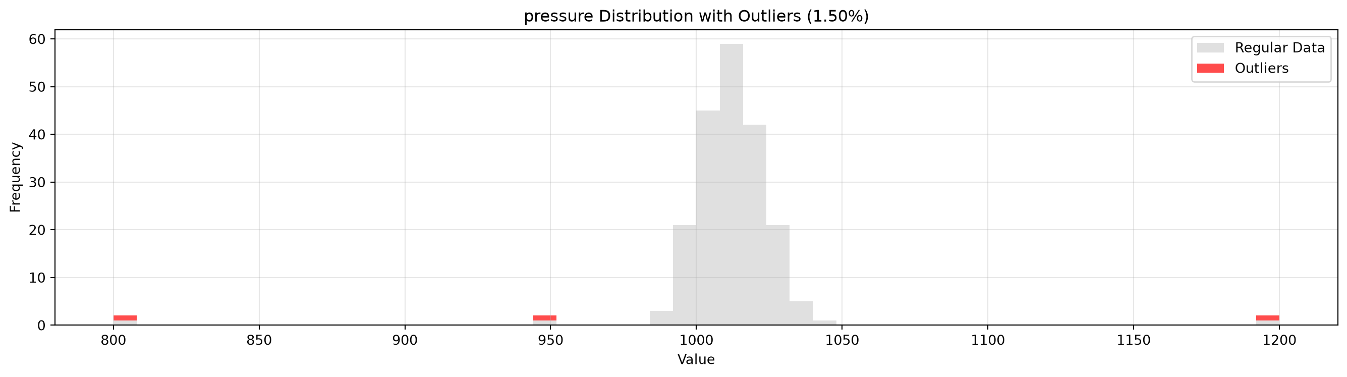
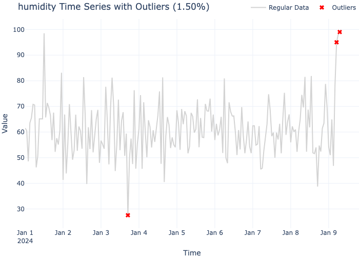
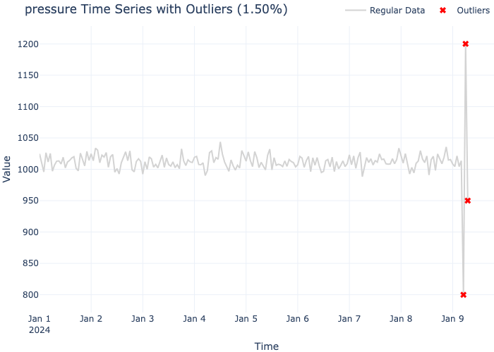
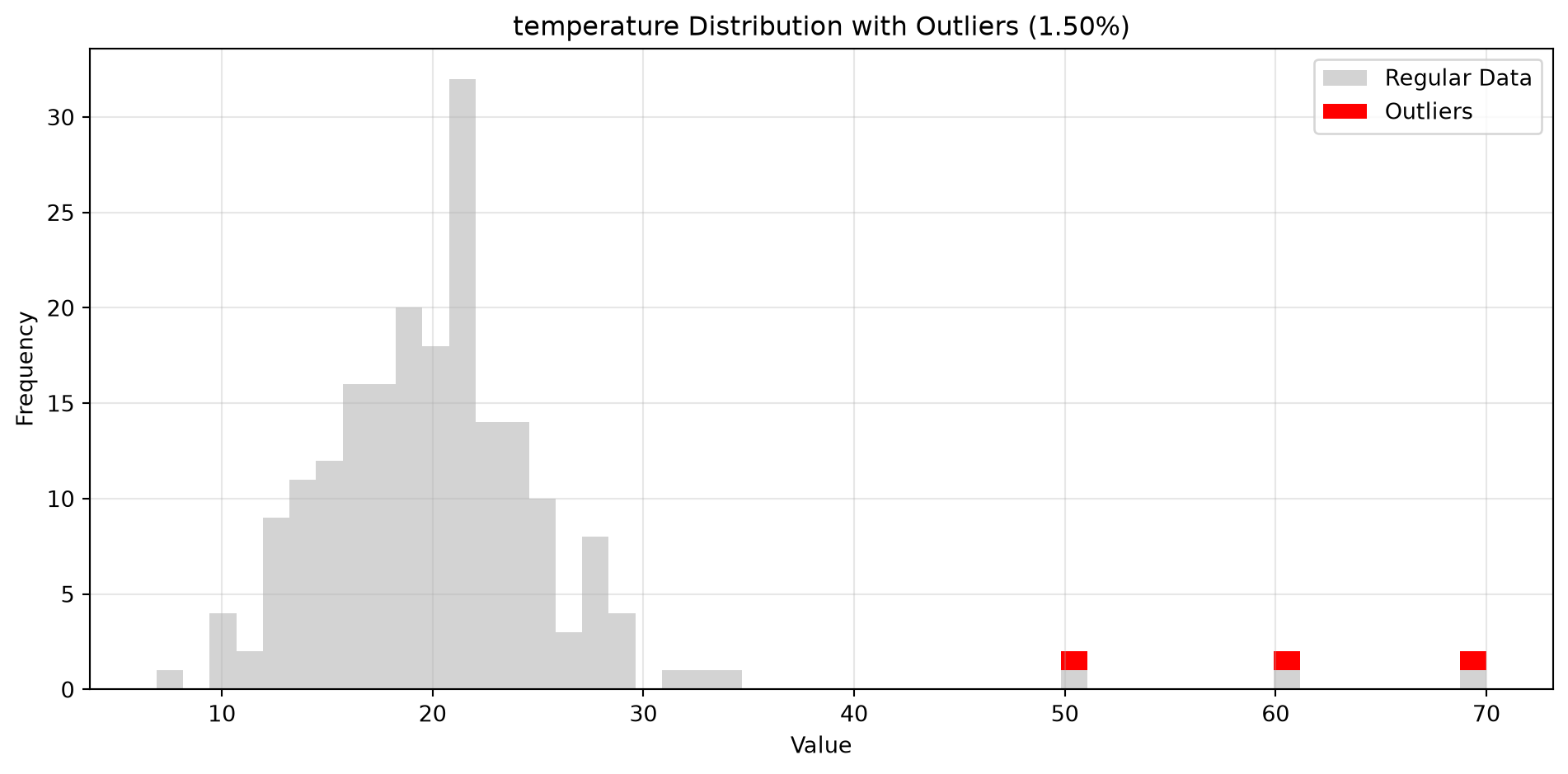
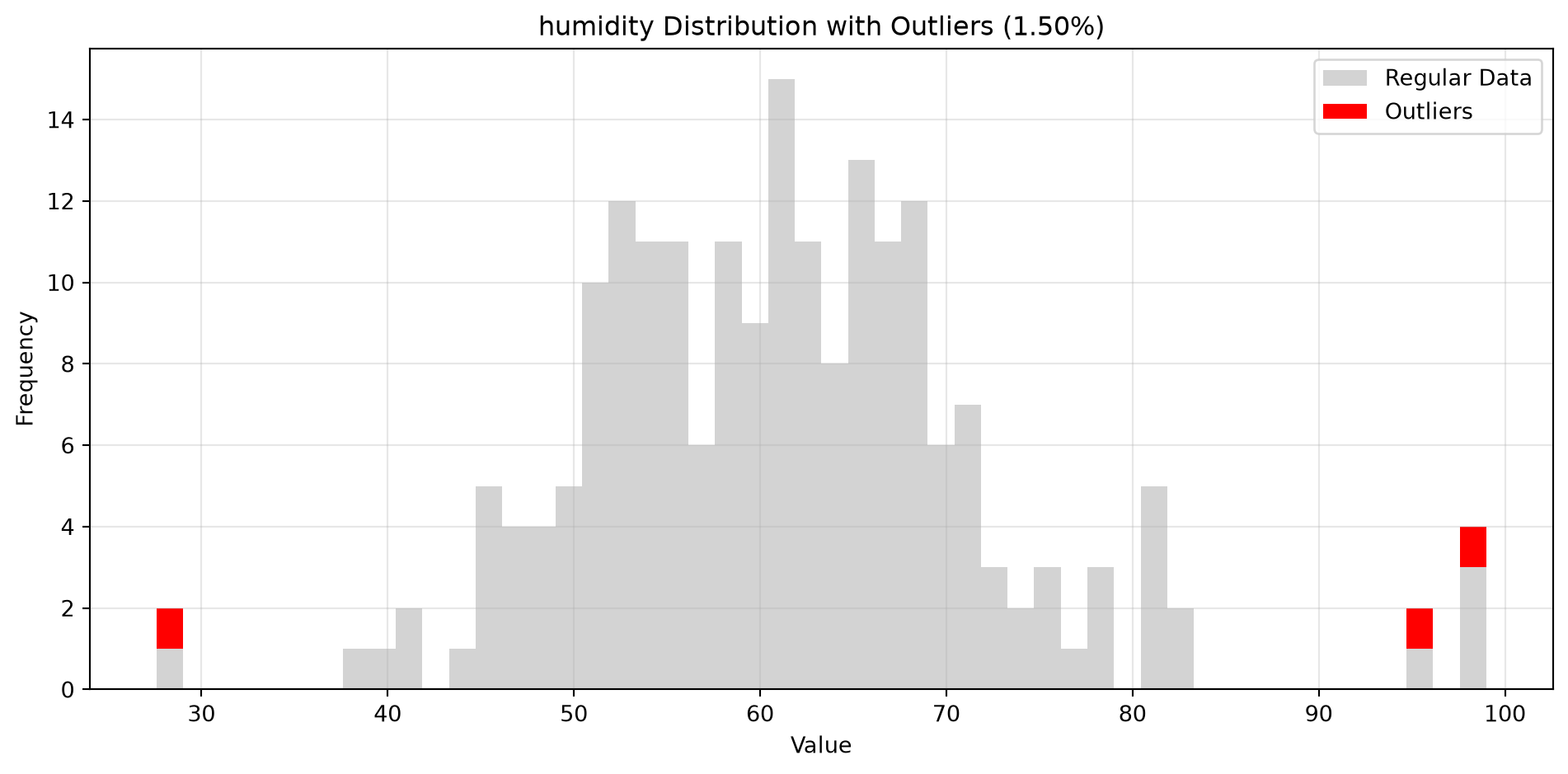
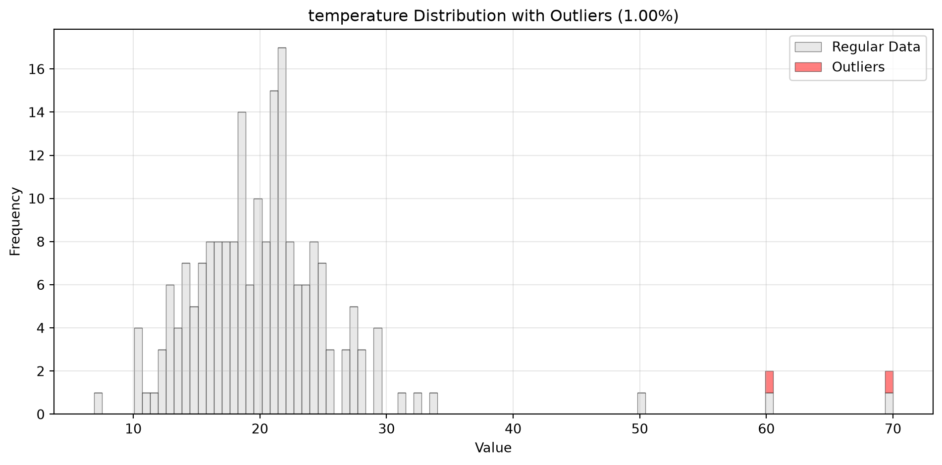
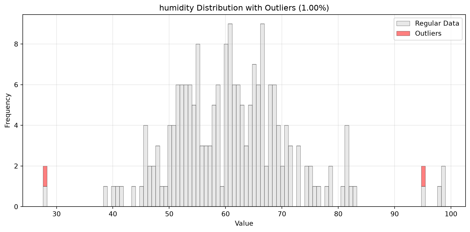
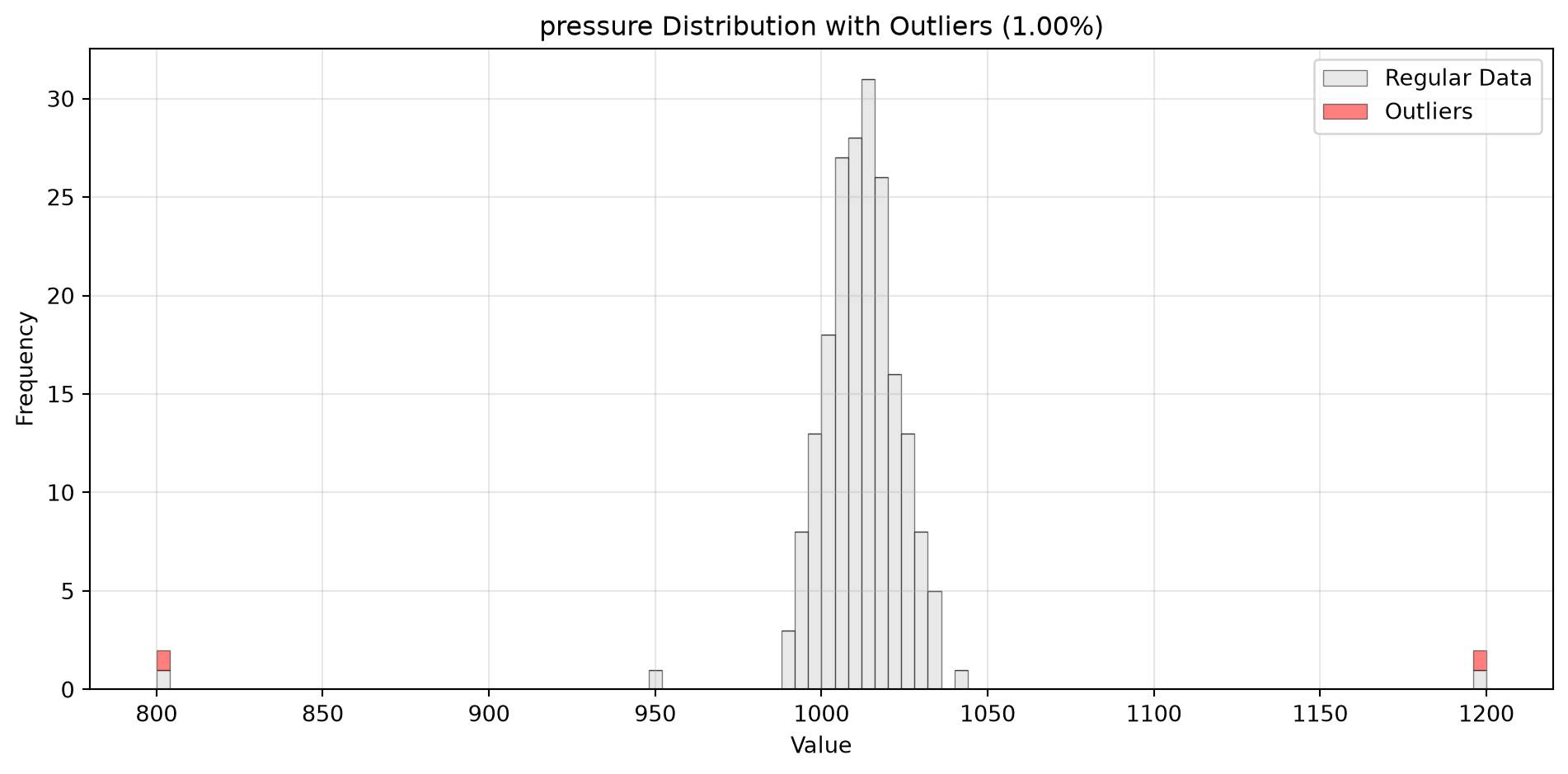
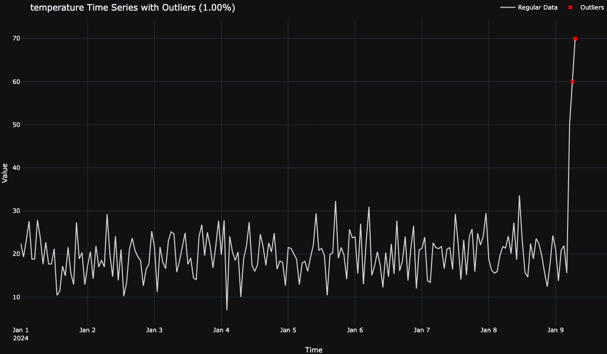
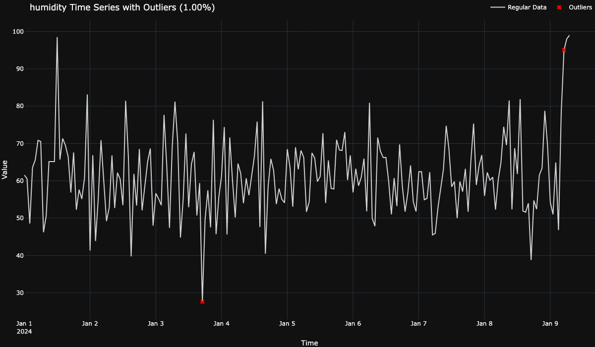
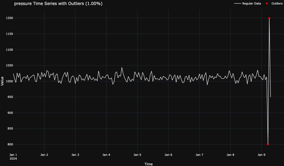
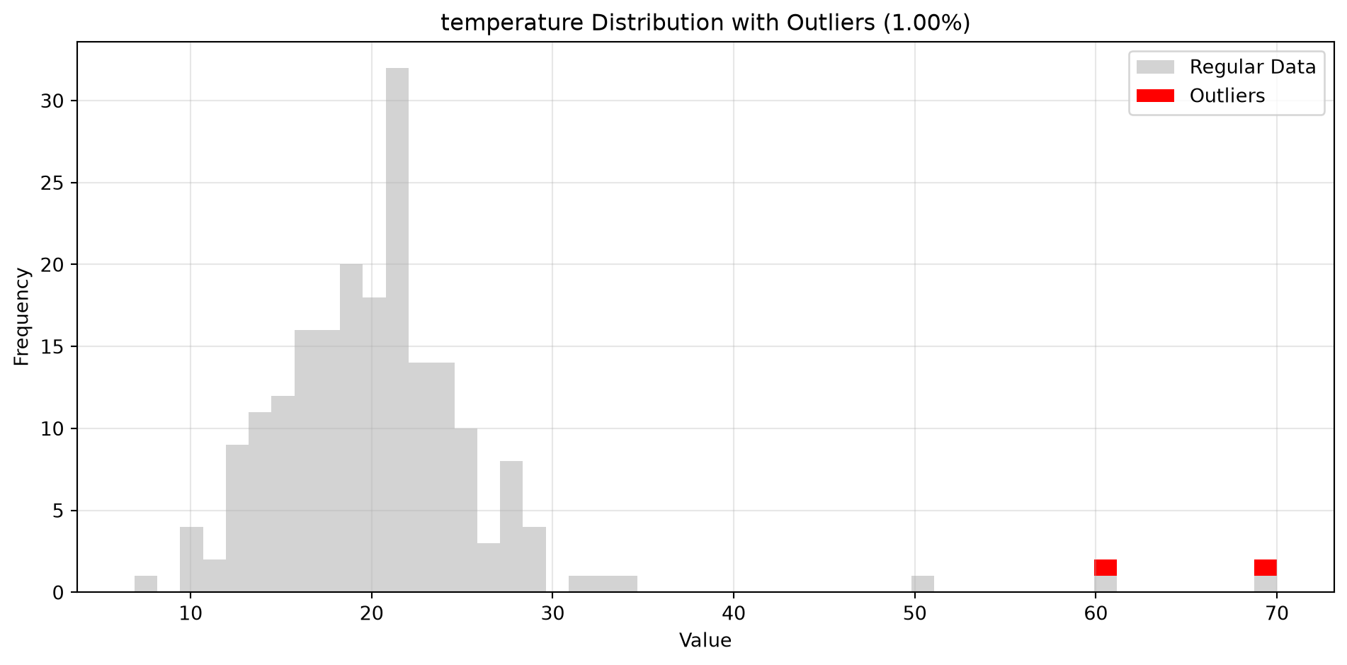
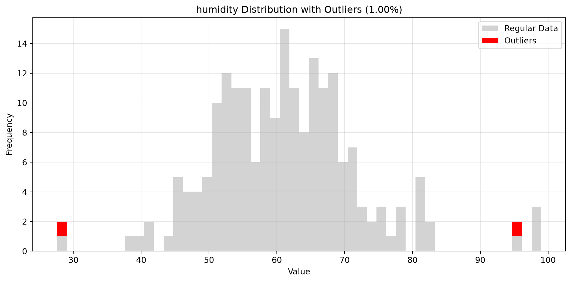
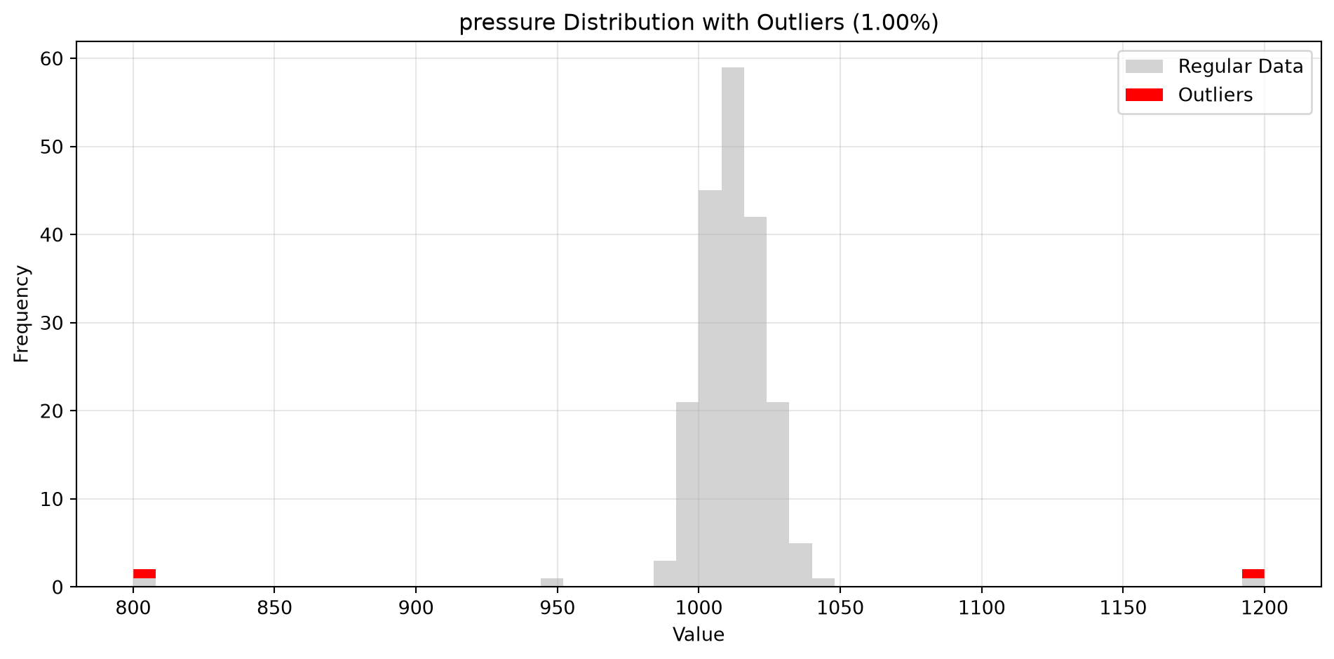
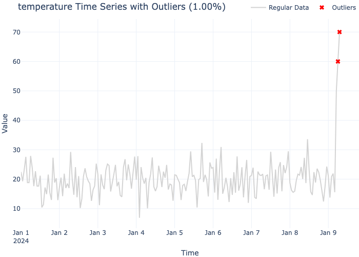
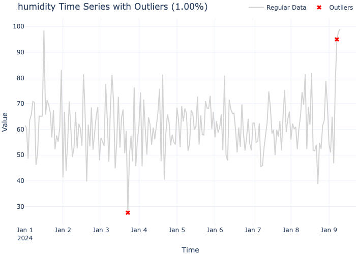
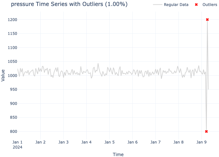
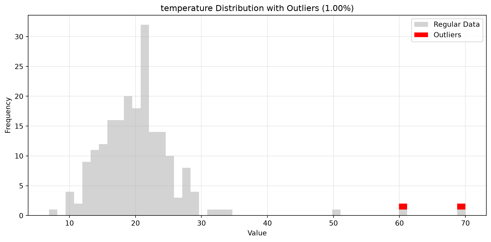
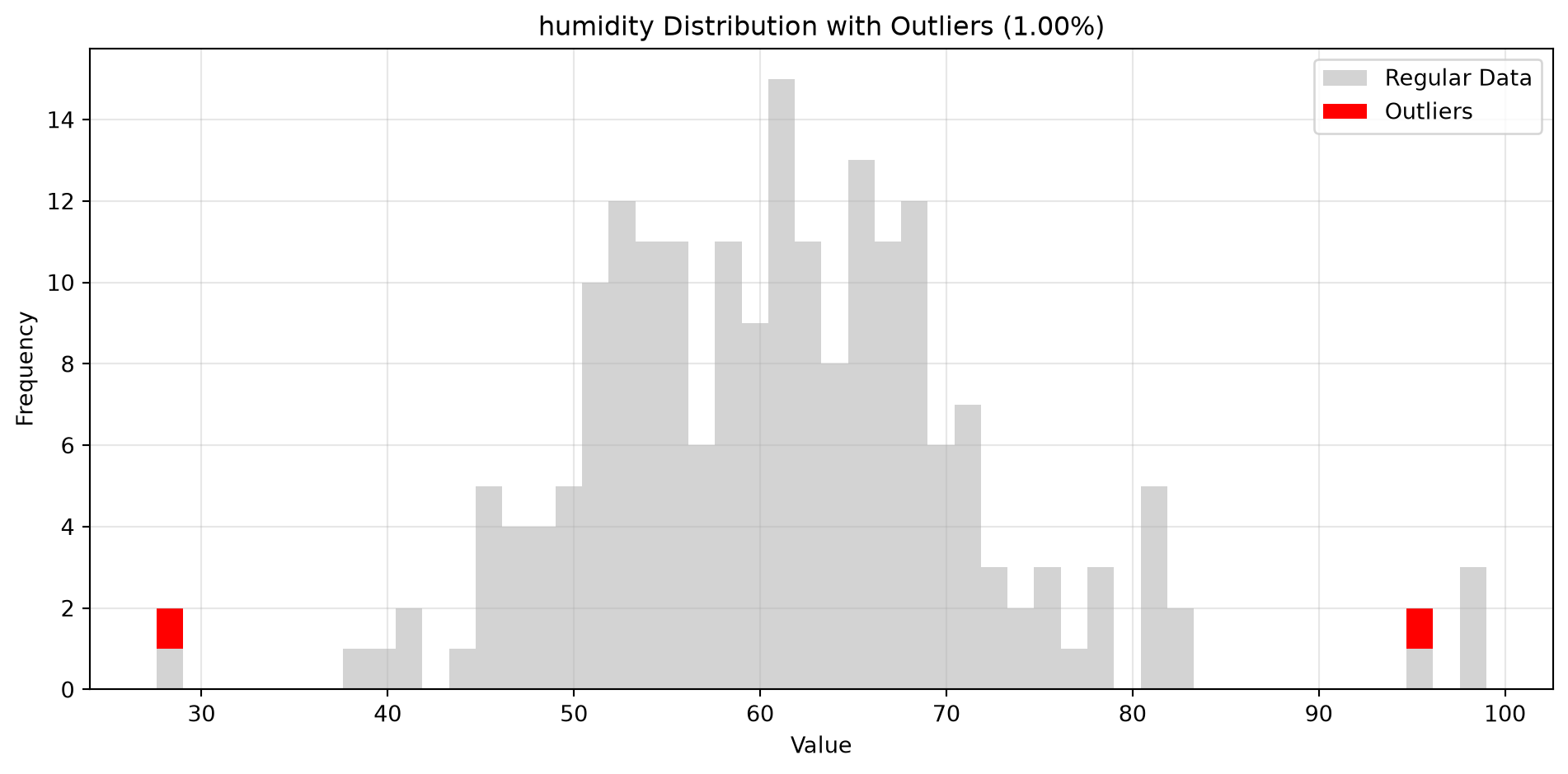
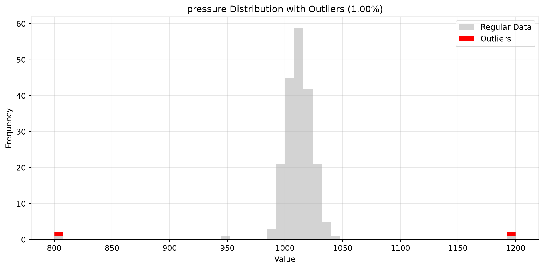
import pandas as pdimport numpy as npfrom spotforecast2_safe.preprocessing.outlier import get_outliersfrom spotforecast2.plots.outlier_plots import (# Create realistic time series data with outliers 42 )= pd.date_range('2024-01-01' , periods= 200 , freq= 'h' )= pd.DataFrame({'temperature' : np.concatenate([20 , 5 , 197 ),50 , 60 , 70 ] # outliers 'humidity' : np.concatenate([60 , 10 , 197 ),95 , 98 , 99 ] # outliers 'pressure' : np.concatenate([1013 , 10 , 197 ),800 , 1200 , 950 ] # outliers = dates)# Make a copy for cleaning = data_original.copy()# Step 1: Detect outliers print ("=== Outlier Detection ===" )= get_outliers(= 0.015 for col, outlier_vals in outliers.items():= (len (outlier_vals) / len (data_original)) * 100 print (f" { col} : { len (outlier_vals)} outliers ( { pct:.2f} %)" )# Step 2: Visualize with histograms print (" \n === Histogram Visualization ===" )= 0.015 ,= (14 , 4 ),= 0.7 # Step 3: Visualize with Plotly (interactive) print (" \n === Interactive Plotly Visualization ===" )= 0.015 ,= 'plotly_white' # Step 4: Selective column visualization print (" \n === Selective Column Analysis ===" )= ['temperature' , 'humidity' ],= 0.015
=== Outlier Detection ===
temperature: 3 outliers (1.50%)
humidity: 3 outliers (1.50%)
pressure: 3 outliers (1.50%)

=== Histogram Visualization ===
=== Interactive Plotly Visualization ===
=== Selective Column Analysis ===
Parameters and Configuration
contamination parameter
The contamination parameter controls the expected proportion of outliers in the dataset:
0.01 (1%) - Conservative, detects severe outliers only0.02 (2%) - Moderate, typical for most applications0.05 (5%) - Liberal, detects more potential anomalies
Choose based on your domain knowledge and data characteristics.
random_state parameter
The random_state parameter ensures reproducibility:
# Same random_state produces consistent results = get_outliers(data, random_state= 42 )= get_outliers(data, random_state= 42 )# outliers1 == outliers2
Matplotlib histogram options
When using visualize_outliers_hist(), you can pass additional matplotlib histogram options:
= 100 , # More granular bins = 0.5 , # Transparency = 'black' , # Border around bars = 0.5 # Border thickness
Plotly layout options
When using visualize_outliers_plotly_scatter(), you can customize the Plotly figure:
= 'plotly_dark' , # Dark theme = 700 , # Figure height = 1200 # Figure width
Algorithm Details
Isolation Forest
The underlying algorithm uses scikit-learn’s IsolationForest, which:
Randomly selects features and split values
Isolates anomalies by exploiting their rarity
Assigns anomaly scores based on path lengths
Marks points with scores exceeding the contamination threshold as outliers
Key characteristics:
No distance computation needed (efficient for high dimensions)
Scales well with number of features
Robust to varying scales
No hyperparameter tuning required beyond contamination
Best Practices
1. Preprocessing
Clean your data before outlier detection:
# Remove missing values = data.dropna()# Standardize if needed from sklearn.preprocessing import StandardScaler= StandardScaler()= pd.DataFrame(= data.index,= data.columns
2. Contamination Estimation
Estimate contamination based on domain knowledge:
# For known outlier percentage = 5 # Example: Domain logic expects ~5 corrupted sensor readings = n_outliers / len (data)# For exploratory analysis, try multiple values for cont in [0.01 , 0.02 , 0.05 ]:= get_outliers(data, contamination= cont)print (f"Contamination { cont} : { len (outliers)} outliers" )
Contamination 0.01: 2 outliers
Contamination 0.02: 2 outliers
Contamination 0.05: 2 outliers
3. Visual Inspection
Always visualize results:
# Histogram for distribution analysis # Time series plot for temporal patterns
4. Validation
Verify outliers make sense in context:
= get_outliers(data, contamination= 0.02 )for col, vals in outliers.items():print (f" \n { col} :" )print (f" Regular range: { data[col]. min ():.2f} - { data[col]. max ():.2f} " )print (f" Outlier values: { sorted (vals.unique())} " )print (f" Outlier indices: { list (vals.index)} " )
A:
  Regular range: -2.62 - 12.00
  Outlier values: [np.float64(10.0), np.float64(11.0), np.float64(12.0)]
  Outlier indices: [100, 101, 102]

B:
  Regular range: 1.16 - 120.00
  Outlier values: [np.float64(100.0), np.float64(110.0), np.float64(120.0)]
  Outlier indices: [100, 101, 102]
Testing
All examples in this guide are validated by tests/test_docs_outliers_examples.py with 43 comprehensive pytest cases covering:
Basic outlier detection functionality
Contamination parameter variations (0.01, 0.02, 0.05)
Random state reproducibility
Data integrity and value validation
Complete workflow integration
Edge cases (small/large datasets, extreme values, NaN handling)
Timeseries data with DatetimeIndex
API examples and return types
Safety-critical behavior validation
The plot_outlier_flags() function has its own unit suite in tests/test_plot_outlier_flags.py, covering figure structure, marker positions, axes injection, and the error paths.
Run the tests:
# Run outliers documentation tests uv run pytest tests/test_docs_outliers_examples.py -v # Quick check uv run pytest tests/test_docs_outliers_examples.py --tb = no -q
Troubleshooting
Issue: No outliers detected
Solution: Increase the contamination parameter:
# Try higher contamination = get_outliers(data, contamination= 0.05 )
Issue: Too many false positives
Solution: Decrease the contamination parameter:
# Be more conservative = get_outliers(data, contamination= 0.01 )
Issue: ImportError for plotly
Solution: Install plotly:
Or use histogram visualization instead: