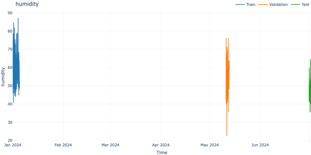
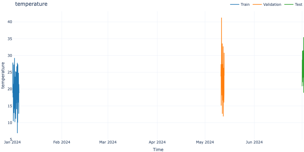
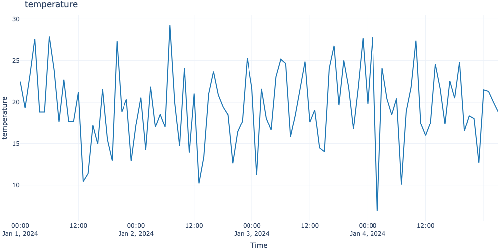
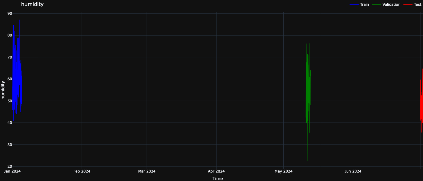
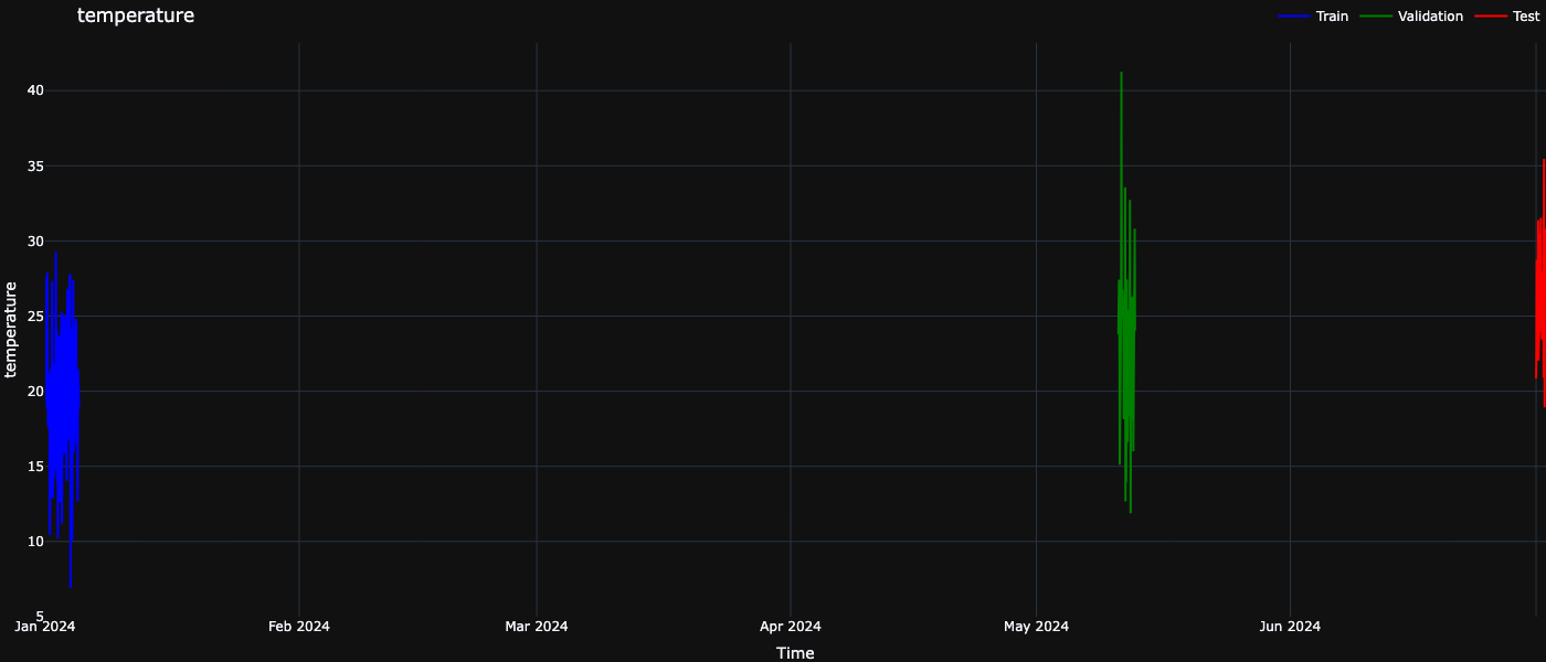
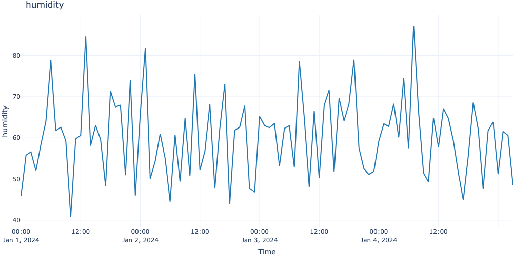
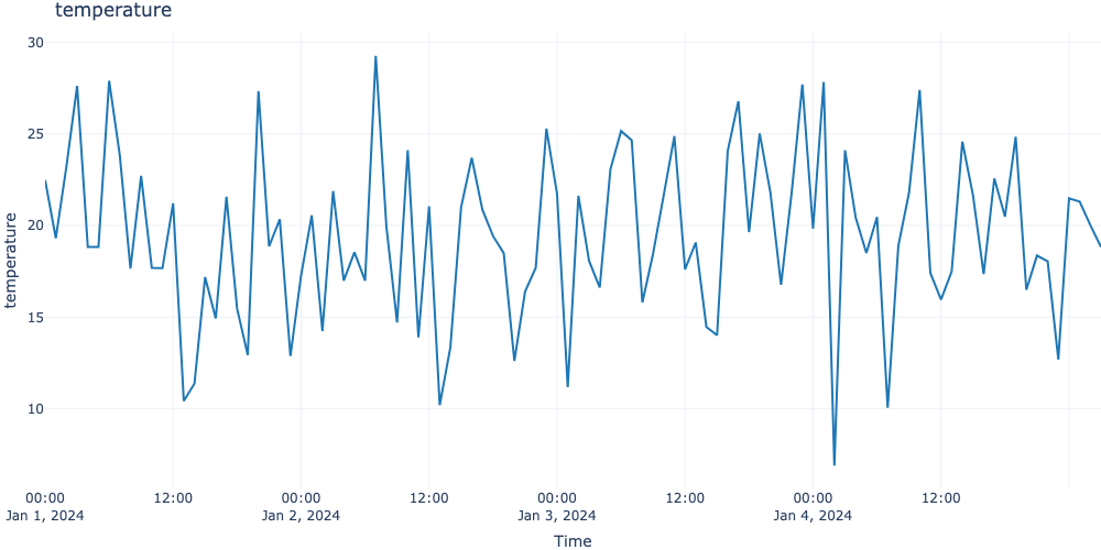
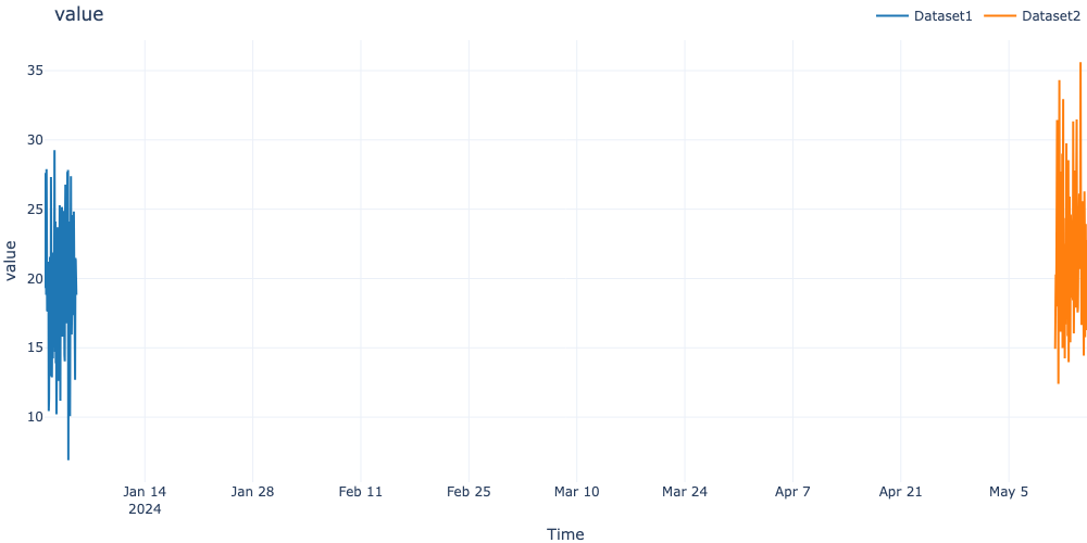
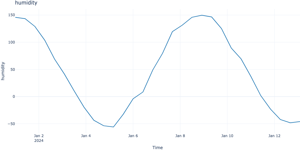
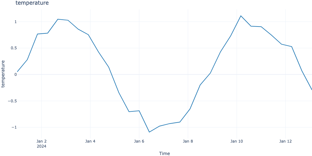
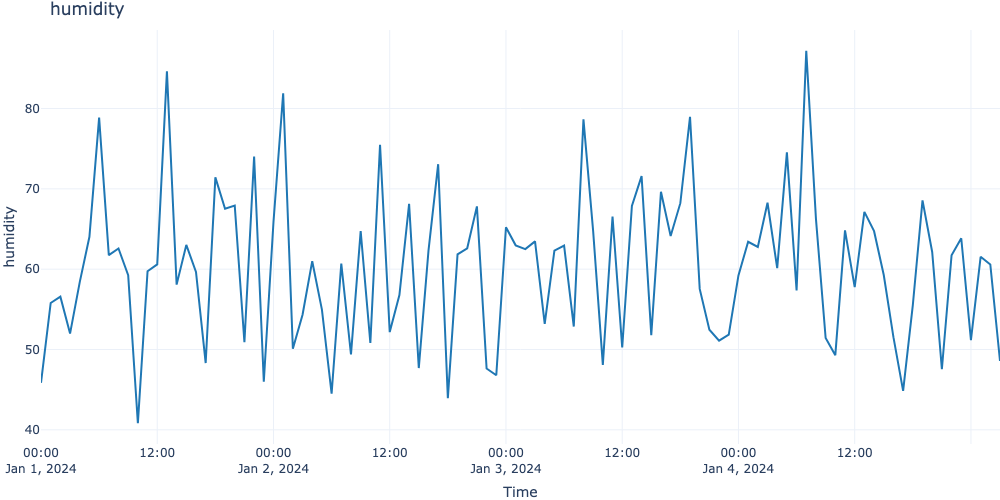
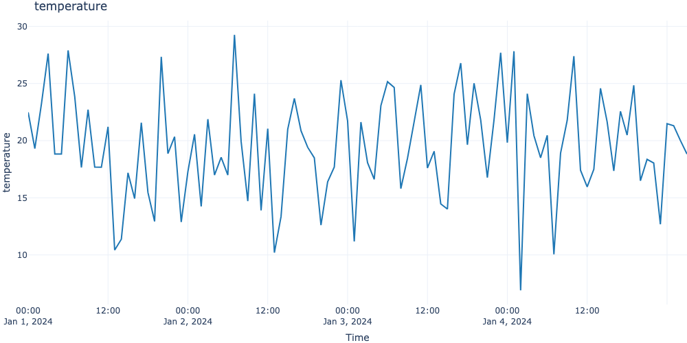
This module provides interactive time series visualization using Plotly, with support for multiple datasets and flexible customization options.
Overview
The time series visualization module includes two main functions:
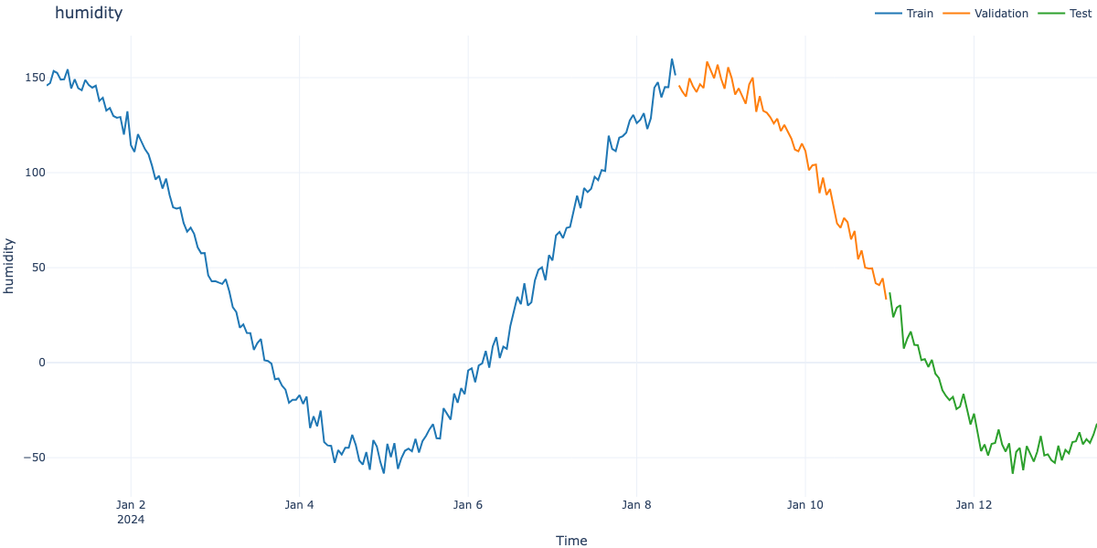
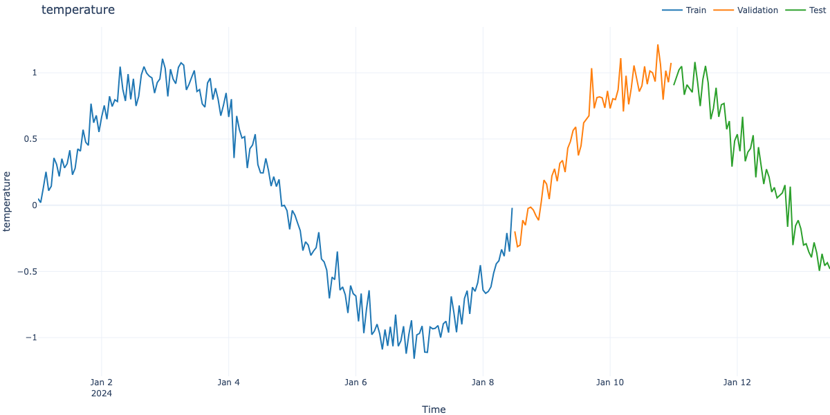
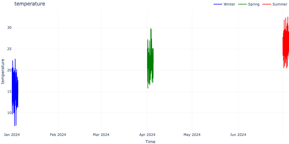
visualize_ts_plotly() - Visualize multiple time series datasets with Plotly
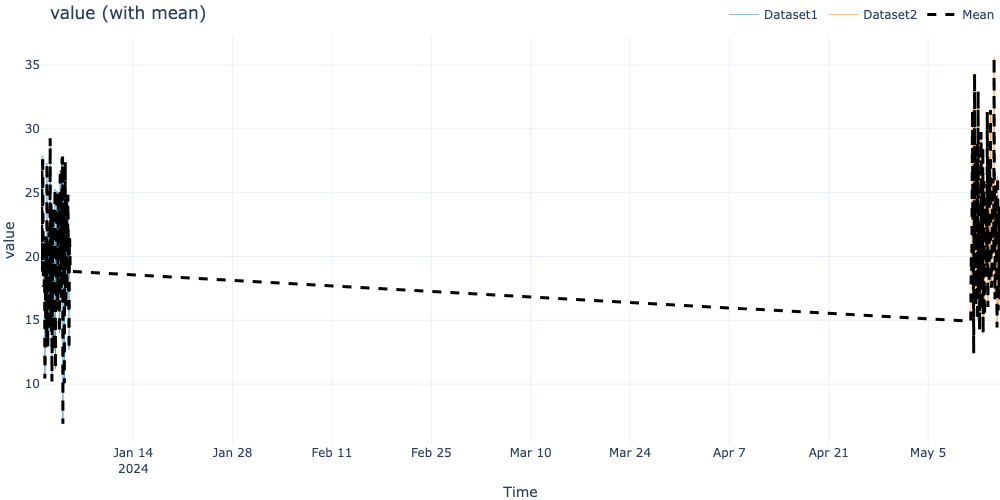
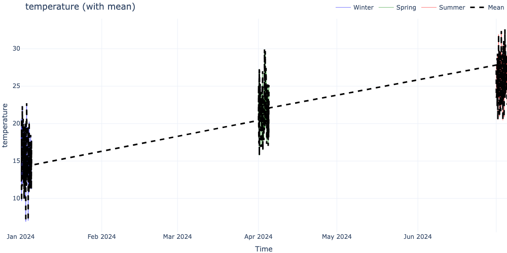
visualize_ts_comparison() - Compare datasets with optional statistical overlays
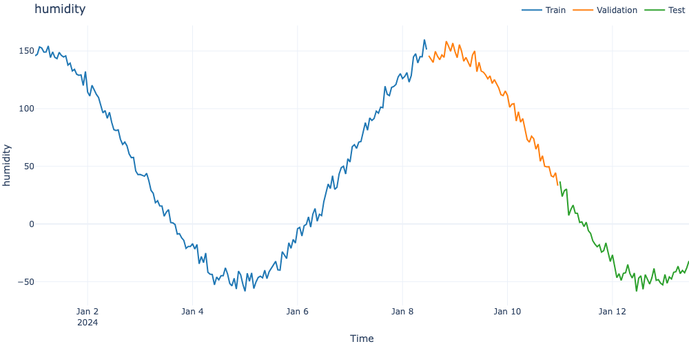
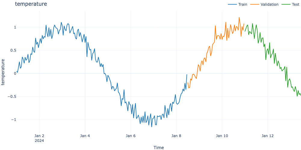
These functions provide a flexible, interactive way to explore time series data with support for train/validation/test splits or any custom dataset groupings.
Installation
The time series visualization functions require plotly:
While visualize_ts_plotly provides highly dynamic web-interactivity, mathematical reporting often requires static, publication-ready vector graphics natively supported by Matplotlib.
plot_zoomed_timeseries()
Creates a two-panel vector plot: The top panel shows the full time series with a highlighted zoom region, and the bottom panel provides a detailed view of that focused local segment.
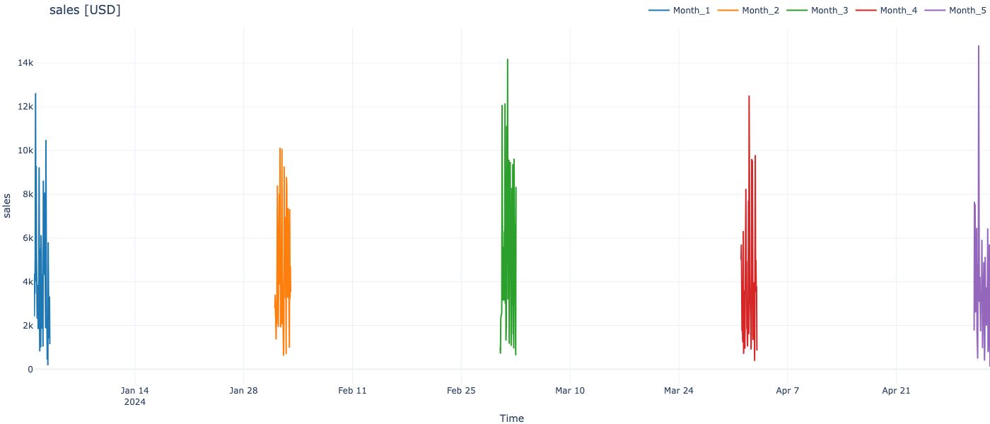
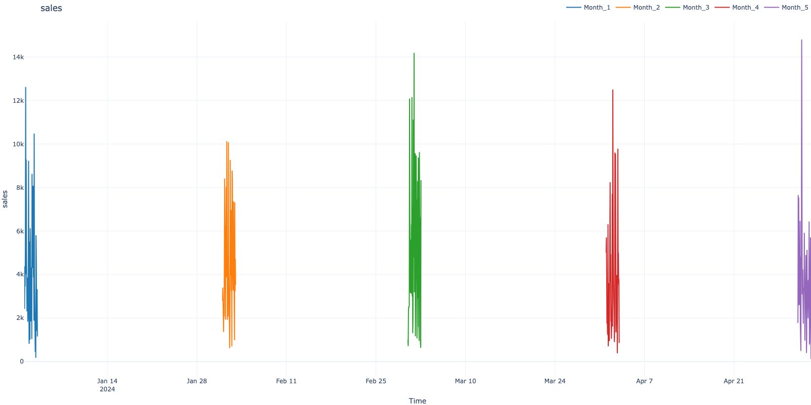
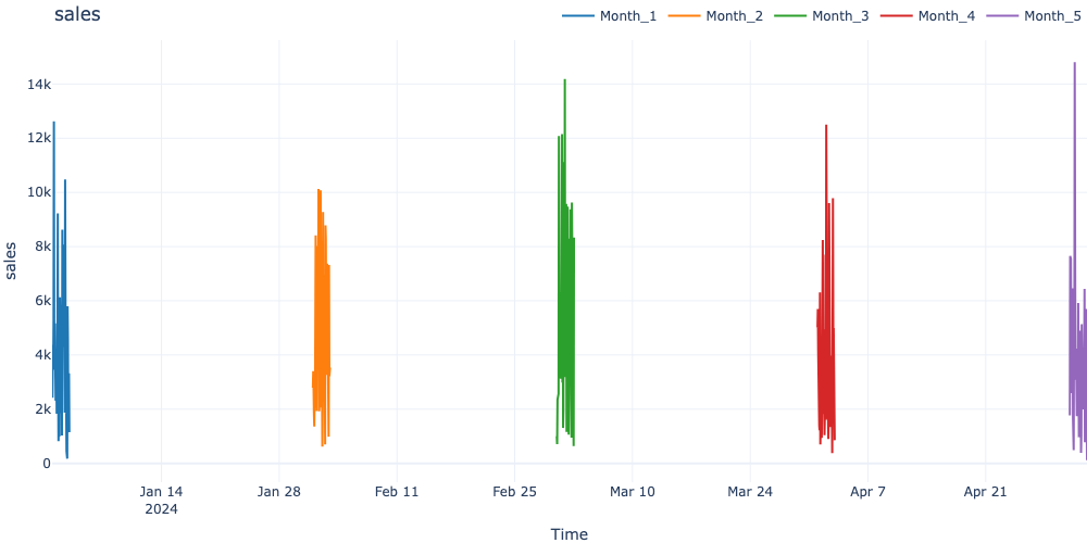
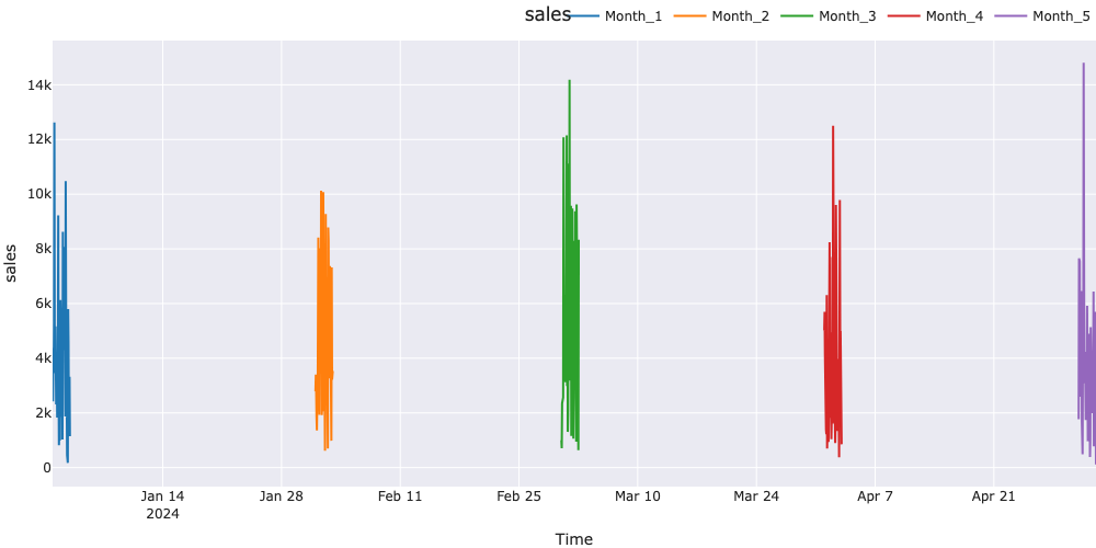
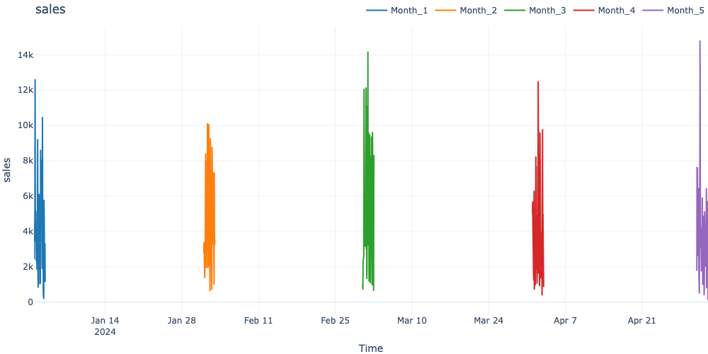
# Function works with any number of datasetsdataframes_dyn = {}for i inrange(5): dates_dyn = pd.date_range(f'2024-{i+1:02d}-01', periods=50, freq='h') dataframes_dyn[f'Month_{i+1}'] = pd.DataFrame({'sales': np.random.gamma(2, 2, 50) *1000 }, index=dates_dyn)visualize_ts_plotly( dataframes_dyn, title_suffix='[USD]', figsize=(1400, 600))
Parameters and Configuration
figsize Parameter
Figure size as (width, height) in pixels:
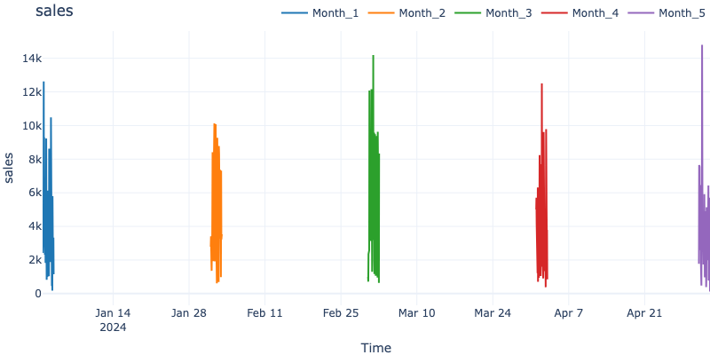
# Small figurevisualize_ts_plotly(dataframes_dyn, figsize=(800, 400))# Large figure for detailed inspectionvisualize_ts_plotly(dataframes_dyn, figsize=(1600, 800))
Template Options
Plotly provides several built-in templates:
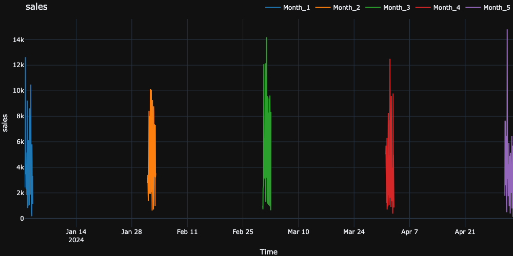
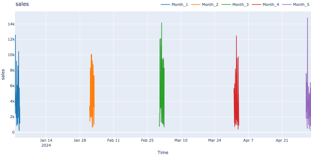
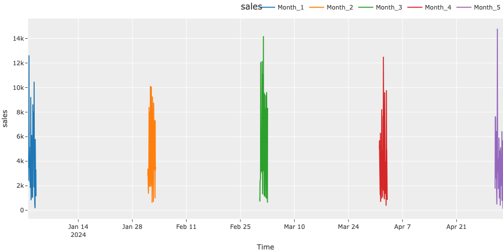
# Light theme (default)visualize_ts_plotly(dataframes_dyn, template='plotly_white')# Dark themevisualize_ts_plotly(dataframes_dyn, template='plotly_dark')# Minimal themevisualize_ts_plotly(dataframes_dyn, template='plotly')# Other themesvisualize_ts_plotly(dataframes_dyn, template='ggplot2')visualize_ts_plotly(dataframes_dyn, template='seaborn')
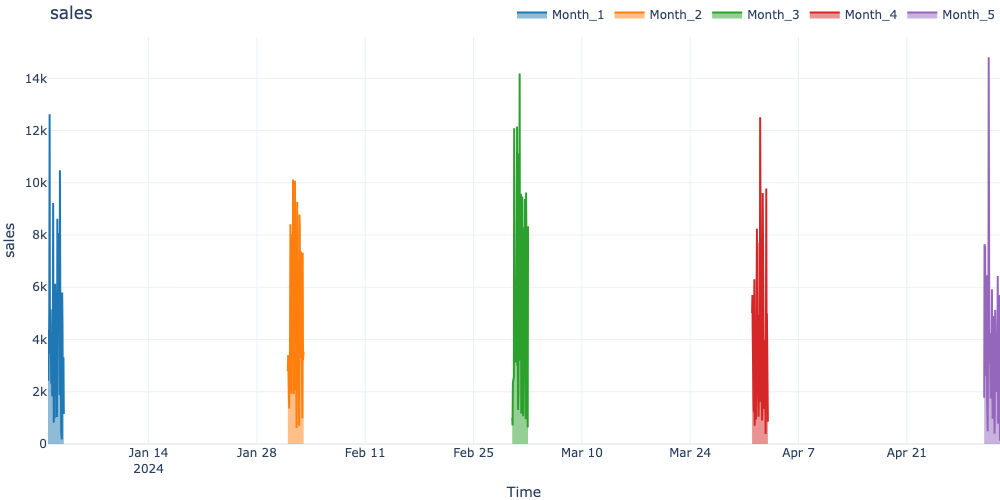
visualize_ts_plotly( dataframes_dyn, fill='tozeroy', # Fill area under line line=dict(width=2), # Line width opacity=0.8# Transparency)
Best Practices
1. Use Datetime Index
Always use pandas datetime index for proper time axis handling:
# Gooddf_good = pd.DataFrame(df_api.values, columns=df_api.columns, index=pd.date_range('2024-01-01', periods=len(df_api), freq='h'))# Avoiddf_bad = pd.DataFrame(df_api.values, columns=df_api.columns) # Will use default integer index
2. Consistent Data Shapes
Ensure all DataFrames have consistent columns for comparison:
# Verify columns matchcolumns_shared =set(df_w.columns) &set(df_s.columns) &set(df_m.columns)ifnot columns_shared:raiseValueError("DataFrames have no common columns")
3. Handle Large Datasets
For large time series, consider subsampling:
# Subsample every 10th pointdf_sub = wf_data[::10]visualize_ts_plotly({'Data': df_sub})
If datasets overlap in time, use separate figures:
# Visualize one column at a timefor col in dataframes_dyn[list(dataframes_dyn.keys())[0]].columns: visualize_ts_plotly(dataframes_dyn, columns=[col])
Issue: Memory Issues with Large Datasets
Downsample before visualization:
# Downsample to hourly (using the dense season data from earlier)df_downsampled = df_season.resample('1D').mean()fig_down = plot_seasonality(df_downsampled, target="value", show=False)plt.close(fig_down)
Issue: Missing Data in Visualization
Handle missing values before visualization:
# Forward fill missing valuesdf_filled = df_api.ffill()visualize_ts_plotly({'Data': df_filled})
Testing
This module includes comprehensive pytest tests validating all documentation examples and API functionality. Tests are located in tests/test_docs_time_series_visualization_examples.py.
Running Tests
Run all time series visualization tests:
uv run pytest tests/test_docs_time_series_visualization_examples.py -v
Run specific test class:
uv run pytest tests/test_docs_time_series_visualization_examples.py::TestVisualizeTimeSeriesPlotlyBasic -v
Test Coverage
The test suite includes 50 comprehensive tests covering: