Campaign-level evaluation plots for forecasting entries over time.
Generalises the daily-metric timeline, hour-of-day error profile, day-ahead forecast overlay, backtest-fold layout, and residual diagnostics of a manuscript’s results section into a reusable, stateless API. All functions return a matplotlib.figure.Figure; the caller is responsible for saving and closing it. None of them call plt.show() nor mutate matplotlib.rcParams — styling and figure lifecycle stay with the caller (set matplotlib.use("Agg") before importing pyplot in headless environments).
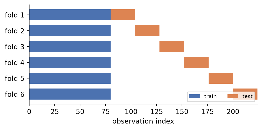
Horizontal-bar layout of rolling-origin backtest folds.
folds is the DataFrame returned by spotforecast2_safe.splitter.TimeSeriesFold.split(y, as_pandas=True): one row per fold with iloc-style [start, end) positions. Each fold is drawn as a training bar followed by a test bar (test_start_with_gap/test_end_with_gap, which equal test_start/test_end when the fold has no gap), so the figure shows the splitter’s real output rather than re-derived arithmetic. Fold 1 is drawn at the top.
╭─────────────────────────────── IgnoredArgumentWarning ───────────────────────────────╮│ Last window cannot be calculated because `window_size` is None. ││││ Category : spotforecast2.exceptions.IgnoredArgumentWarning ││ Location : ││ /Users/bartz/workspace/spotforecast2/.venv/lib/python3.13/site-packages/spotforecast ││ 2_safe/splitter/split_ts_cv.py:496 ││ Suppress : warnings.simplefilter('ignore', category=IgnoredArgumentWarning) │╰──────────────────────────────────────────────────────────────────────────────────────╯
Information of folds
--------------------
Number of observations used for initial training: 80
Number of observations used for backtesting: 144
    Number of folds: 6
    Number skipped folds: 0
    Number of steps per fold: 24
    Number of steps to exclude between last observed data (last window) and predictions (gap): 0

Fold: 0
    Training:   2024-01-01 00:00:00+00:00 -- 2024-01-04 07:00:00+00:00  (n=80)
    Validation: 2024-01-04 08:00:00+00:00 -- 2024-01-05 07:00:00+00:00  (n=24)
Fold: 1
    Training:   No training in this fold
    Validation: 2024-01-05 08:00:00+00:00 -- 2024-01-06 07:00:00+00:00  (n=24)
Fold: 2
    Training:   No training in this fold
    Validation: 2024-01-06 08:00:00+00:00 -- 2024-01-07 07:00:00+00:00  (n=24)
Fold: 3
    Training:   No training in this fold
    Validation: 2024-01-07 08:00:00+00:00 -- 2024-01-08 07:00:00+00:00  (n=24)
Fold: 4
    Training:   No training in this fold
    Validation: 2024-01-08 08:00:00+00:00 -- 2024-01-09 07:00:00+00:00  (n=24)
Fold: 5
    Training:   No training in this fold
    Validation: 2024-01-09 08:00:00+00:00 -- 2024-01-10 07:00:00+00:00  (n=24)

Figure
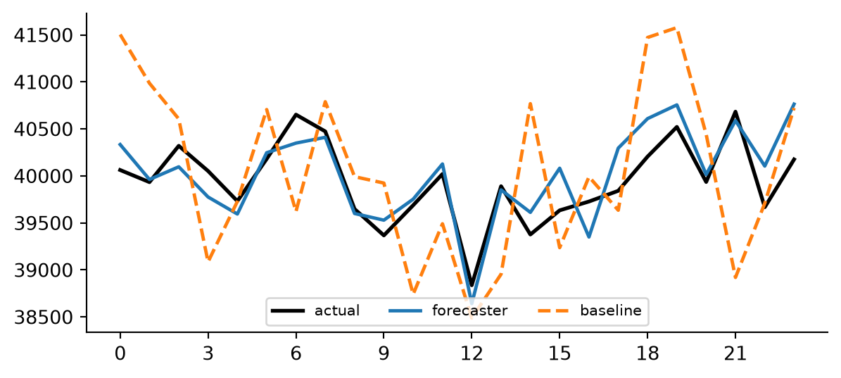
One or more forecasts overlaid against an optional actual series.
actual, when given, is drawn first and slightly thicker than the forecast lines (linewidth + 0.2) so it reads as the reference trace. Each entry in forecasts is then drawn in insertion order.
"index" plots every series against its own index as-is; "hour" plots against index.hour (e.g. to overlay several day-ahead forecasts for the same target day on a 0-23 axis).
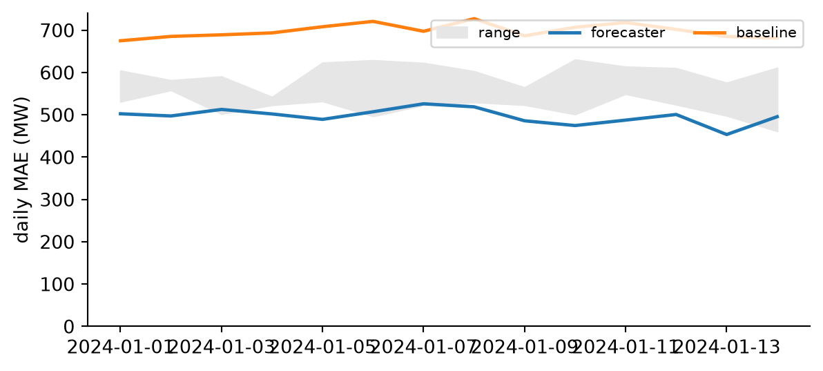
Daily-metric timeline for one or more entries, with an optional range band.
Each series in series is plotted over its own (datetime) index after dropna(), so entries that join or leave the campaign at different dates are drawn only over their own scored period. When band is given, its row-wise min/max is drawn as a filled band underneath the lines (e.g. the range spanned by a group of reference entries).
Optional DataFrame whose row-wise min and max are filled between (e.g. the daily metric of a group of entries). Its index must be datetime-like and comparable to the series indices.
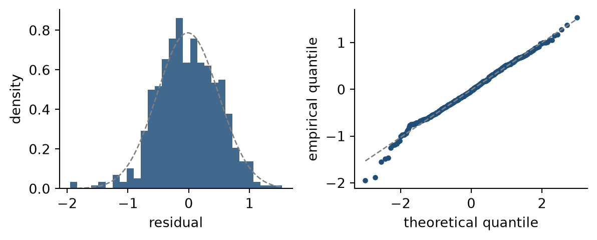
Two-panel residual diagnostics: histogram and normal QQ plot.
The left panel shows the residual histogram (density scale) with an overlaid normal density fitted to the empirical mean and standard deviation. The right panel is a QQ plot of the sorted residuals against standard-normal quantiles with the fitted reference line. Like the other two-panel figures in this package, the function always creates its own figure and takes no ax argument.