plots.comparison

plots.comparison

Cross-entry comparison plots for forecasting campaigns / leaderboards.

Generalises the rank-stability bump chart and the critical-difference diagram of a manuscript’s results section into a reusable, stateless API. Both functions return a matplotlib.figure.Figure; the caller is responsible for saving and closing it. Neither function calls plt.show() nor mutates matplotlib.rcParams — styling and figure lifecycle stay with the caller (set matplotlib.use("Agg") before importing pyplot in headless environments).

Functions

Name Description
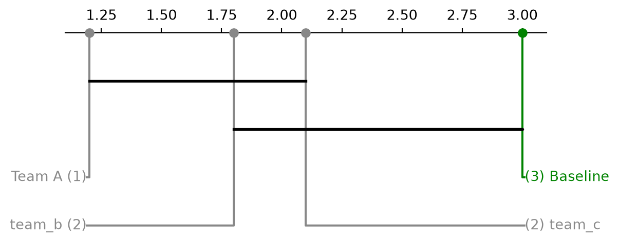
plot_critical_difference Critical-difference diagram (Demsar layout) over paired entries.
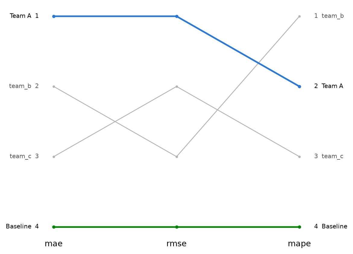
plot_rank_stability Bump chart of entry ranks across a set of metrics.
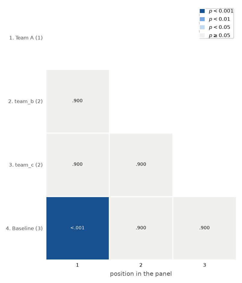
plot_significance_matrix Lower-triangular heatmap of every adjusted pairwise p-value.

plot_critical_difference

plots.comparison.plot_critical_difference(
    positions,
    sig_matrix,
    *,
    labels=None,
    color_palette=None,
    alpha=0.05,
    label_fmt_left='{label} ({rank:.0f})',
    label_fmt_right='({rank:.0f}) {label}',
    label_props=None,
    ax=None,
    figsize=(6.3, 2.8),
)

Critical-difference diagram (Demsar layout) over paired entries.

Thin wrapper over scikit_posthocs.critical_difference_diagram. scikit_posthocs pulls in seaborn at import time, so it is imported lazily inside this function rather than at module scope (the same precedent as plots.diagnostics.plot_shap_summary for shap).

Parameters

Name Type Description Default
positions pd.Series Lower-is-better summary statistic (e.g. mean MAE) per entry, indexed by entry id. required
sig_matrix pd.DataFrame Square, symmetric p-value frame indexed and columned by the same entry ids as positions. required
labels Mapping[str, str] | None Mapping of entry id to display name. When given, both positions and sig_matrix are renamed before plotting, and color_palette keys (which refer to the original ids) are renamed to match. None
color_palette Mapping[str, str] | None Mapping of entry id (original id, renamed automatically when labels is given) to a color for that entry’s marker and label. scikit_posthocs requires a color for every entry in positions once a palette is given. None
alpha float Significance level used to draw crossbars between entries that are not significantly different. 0.05
label_fmt_left str Format string for labels left of the first rank marker; {label} and {rank} are available. '{label} ({rank:.0f})'
label_fmt_right str Format string for labels right of the last rank marker. '({rank:.0f}) {label}'
label_props Mapping[str, object] | None Extra keyword arguments forwarded to the label text objects (e.g. {"fontsize": 8}). None
ax Axes | None Existing axes to draw into. When given, no new figure is created and the function returns ax.figure. None
figsize tuple[float, float] Figure size used when ax is not given. (6.3, 2.8)

Returns

Name Type Description
Figure A matplotlib.figure.Figure.

Examples

import pandas as pd
from spotforecast2.plots.comparison import plot_critical_difference

positions = pd.Series(
    {"team_a": 1.2, "team_b": 1.8, "team_c": 2.1, "baseline": 3.0}
)
entries = list(positions.index)
sig_matrix = pd.DataFrame(1.0, index=entries, columns=entries)
sig_matrix.loc["team_a", "baseline"] = 0.01
sig_matrix.loc["baseline", "team_a"] = 0.01

# scikit-posthocs requires a color for every entry when a palette is
# given.
palette = {entry_id: "#888888" for entry_id in entries}
palette["baseline"] = "#008300"
fig = plot_critical_difference(
    positions,
    sig_matrix,
    labels={"team_a": "Team A", "baseline": "Baseline"},
    color_palette=palette,
)
print(type(fig).__name__)
Figure

plot_rank_stability

plots.comparison.plot_rank_stability(
    ranks,
    *,
    labels=None,
    highlight=None,
    base_color='0.7',
    highlight_linewidth=2.0,
    base_linewidth=1.0,
    marker_size=2.0,
    highlight_marker_size=3.0,
    label_fontsize=7.5,
    label_color=None,
    muted_label_color='0.35',
    annotate=True,
    tick_labelsize=None,
    tick_labelcolor=None,
    ax=None,
    figsize=(6.3, 5.2),
)

Bump chart of entry ranks across a set of metrics.

ranks has one row per entry (the index holds the entry id) and one column per metric, in the order the metrics should appear on the x axis. Cell values are the entry’s integer rank under that metric. A line connects each entry’s rank across the metrics; entries listed in highlight are drawn with a thicker line, a larger marker, and their given color, while every other entry shares base_color.

Parameters

Name Type Description Default
ranks pd.DataFrame DataFrame indexed by entry id, one integer-rank column per metric, column order defines the x order. required
labels Mapping[str, str] | None Mapping of entry id to display name used in the annotate=True text labels. Entries missing from the mapping fall back to their raw id. None
highlight Mapping[str, str] | None Mapping of entry id to the color used for that entry’s line, marker, and (in full ink) its labels. Entries not present here are drawn in base_color. None
base_color str Line/marker color for entries not in highlight. '0.7'
highlight_linewidth float Line width for highlighted entries. 2.0
base_linewidth float Line width for non-highlighted entries. 1.0
marker_size float Marker size for non-highlighted entries. 2.0
highlight_marker_size float Marker size for highlighted entries. 3.0
label_fontsize float Font size of the annotate=True text labels. 7.5
label_color str | None Text color of the labels of highlighted entries. Defaults to None, which uses the ambient matplotlib.rcParams["text.color"]. None
muted_label_color str Text color of the labels of non-highlighted entries. '0.35'
annotate bool When True, write "label rank" to the left of the first column and "rank label" to the right of the last column for every entry. The labels are drawn with clip_on=False, so they render outside the axes box — widen the figure margins (e.g. via fig.subplots_adjust) to make room for them. True
tick_labelsize float | None Font size of the x tick labels. Defaults to None (leave the ambient size). None
tick_labelcolor str | None Color of the x tick labels. Defaults to None (leave the ambient color). None
ax Axes | None Existing axes to draw into. When given, no new figure is created and the function returns ax.figure. None
figsize tuple[float, float] Figure size used when ax is not given. (6.3, 5.2)

Returns

Name Type Description
Figure A matplotlib.figure.Figure.

Examples

import pandas as pd
from spotforecast2.plots.comparison import plot_rank_stability

ranks = pd.DataFrame(
    {
        "mae": [1, 2, 3, 4],
        "rmse": [1, 3, 2, 4],
        "mape": [2, 1, 3, 4],
    },
    index=["team_a", "team_b", "team_c", "baseline"],
)
fig = plot_rank_stability(
    ranks,
    labels={"team_a": "Team A", "baseline": "Baseline"},
    highlight={"team_a": "#2a78d6", "baseline": "#008300"},
)
print(type(fig).__name__)
Figure

plot_significance_matrix

plots.comparison.plot_significance_matrix(
    positions,
    sig_matrix,
    *,
    labels=None,
    color_palette=None,
    bins=P_VALUE_BINS,
    shades=None,
    row_fmt='{position}. {label} ({rank:.0f})',
    xlabel='position in the panel',
    fontsize=5.5,
    label_fontsize=6.5,
    ax=None,
    figsize=(6.3, 5.0),
)

Lower-triangular heatmap of every adjusted pairwise p-value.

A companion to plot_critical_difference over the same panel, and often a replacement for it. The crossbars of a critical-difference diagram are maximal sets of mutually indistinguishable entries drawn as plain spans, so a bar also covers entries it excludes, and reading membership off the span alone can invert a finding. This view gives every comparison its own cell, and it stays readable at panel sizes where the crossbar layout does not.

Entries are ordered by positions, lower first, and numbered accordingly. Each cell compares the entry naming its row with the entry whose number labels its column, so the first row is deliberately blank: the leading entry has no lower-numbered counterpart.

Parameters

Name Type Description Default
positions pd.Series Lower-is-better summary statistic (e.g. mean MAE) per entry, indexed by entry id. Its order after sorting defines the row and column order. required
sig_matrix pd.DataFrame Square, symmetric frame of adjusted p-values indexed and columned by the same entry ids as positions. required
labels Mapping[str, str] | None Mapping of entry id to display name. Entries missing from the mapping fall back to their raw id. None
color_palette Mapping[str, str] | None Mapping of entry id to the color of that entry’s row label. Entries not present are drawn in the muted ink. None
bins Sequence[float] Ascending p-value band edges, from 0 to 1. One shade is used per band, so shades must be one shorter than bins. P_VALUE_BINS
shades Sequence[str] | None Fill color per band, in the order of bins. Defaults to style.SEQUENTIAL_BLUE reversed, which paints the strongest evidence darkest. Cell text switches between white and ink by WCAG luminance, so a custom ramp stays readable. None
row_fmt str Format string for the row labels. {position}, {label} and {rank} are available, the last being the entry’s value in positions. '{position}. {label} ({rank:.0f})'
xlabel str Caption under the column numbers. 'position in the panel'
fontsize float Font size of the p-values inside the cells. 5.5
label_fontsize float Font size of the row and column labels. 6.5
ax Axes | None Existing axes to draw into. When given, no new figure is created and the function returns ax.figure. None
figsize tuple[float, float] Figure size used when ax is not given. (6.3, 5.0)

Returns

Name Type Description
Figure A matplotlib.figure.Figure.

Raises

Name Type Description
ValueError If shades is not one shorter than bins, or if sig_matrix does not cover every entry in positions.

Examples

import pandas as pd
from spotforecast2.plots.comparison import plot_significance_matrix

positions = pd.Series(
    {"team_a": 1.1, "team_b": 1.9, "team_c": 2.4, "baseline": 3.2}
)
entries = list(positions.index)
sig_matrix = pd.DataFrame(0.9, index=entries, columns=entries)
sig_matrix.loc["team_a", "baseline"] = 0.0004
sig_matrix.loc["baseline", "team_a"] = 0.0004

fig = plot_significance_matrix(
    positions,
    sig_matrix,
    labels={"team_a": "Team A", "baseline": "Baseline"},
)
print(type(fig).__name__)
Figure